Is climate change a myth? To use a little old-fashioned English slang, not on your nelly.
Every New Year, the Australian Bureau of Meteorology publishes on its website a measure of Australia’s climate change.
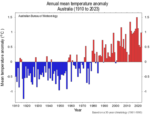
Its formal name is “Annual mean temperature anomaly Australia (1910-2023)” but it is a simple blue and red graphic, with blue showing cooling and red showing warming.
It shows temperature anomalies, year by year. A temperature anomaly, says the US National Centers for Environmental Information website, is the difference between observed temperature and a long-term baseline.
For this graphic, the baseline covers 30 years – 1961-1990.
A positive anomaly indicates the measured temperature was warmer than the baseline; a negative anomaly indicates the observed temperature was cooler than the baseline.
The BoM graph shows a cooling trend up until the late-1970s and a warming trend from the mid-1980s.
National Geographic says “weather” refers to short-term changes while “climate” refers to atmospheric changes over longer periods, usually 30 years or more.
Looking at the graph, the arithmetic is simple. This little graph provides persuasive evidence that Australia is not just experiencing bad weather: the climate has changed.

David Armstrong is an Australian journalist and editor with decades of experience, including as editor-in-chief of The Australian, editor of The Bulletin and The Canberra Times and deputy editor the Daily Telegraph in Australia. He is also former editor and editor-in-chief of the South China Morning Post, former president of the Bangkok Post company, former chair of the Phnom Penh Post company and is current chair of ucanews.com.

